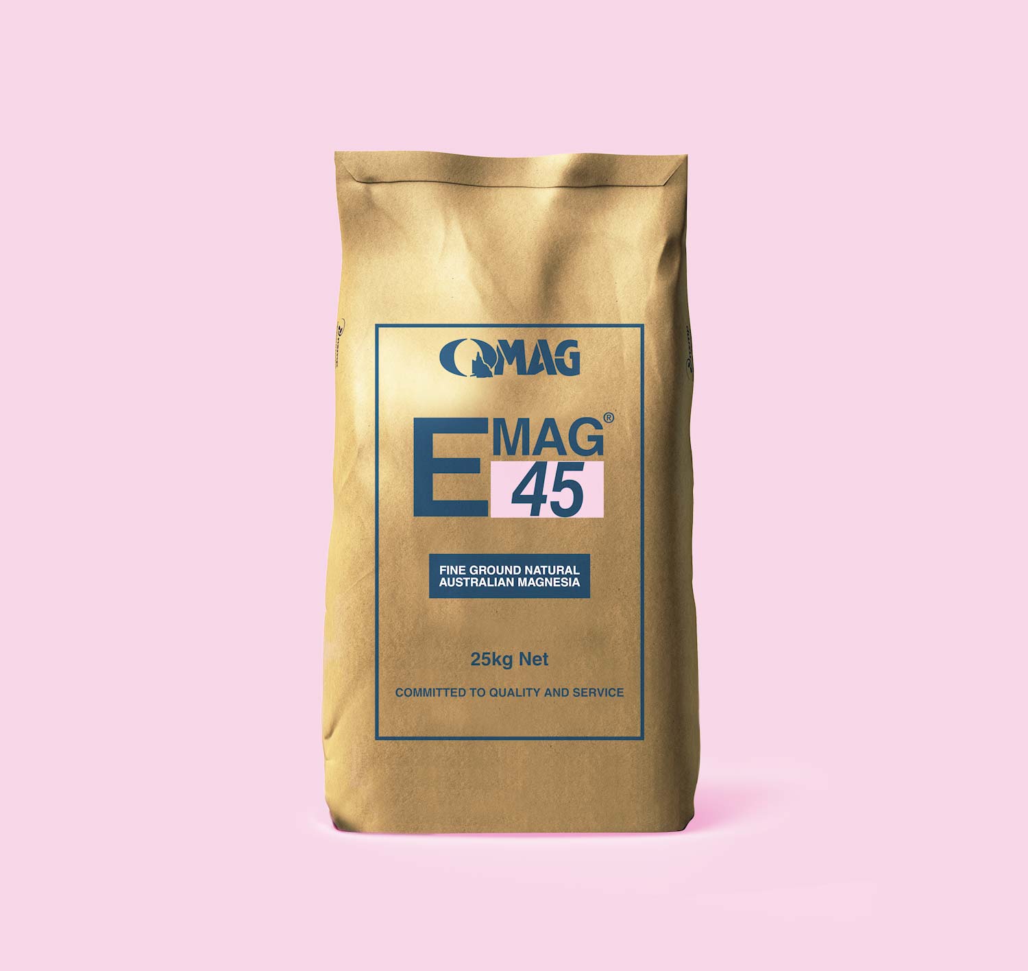
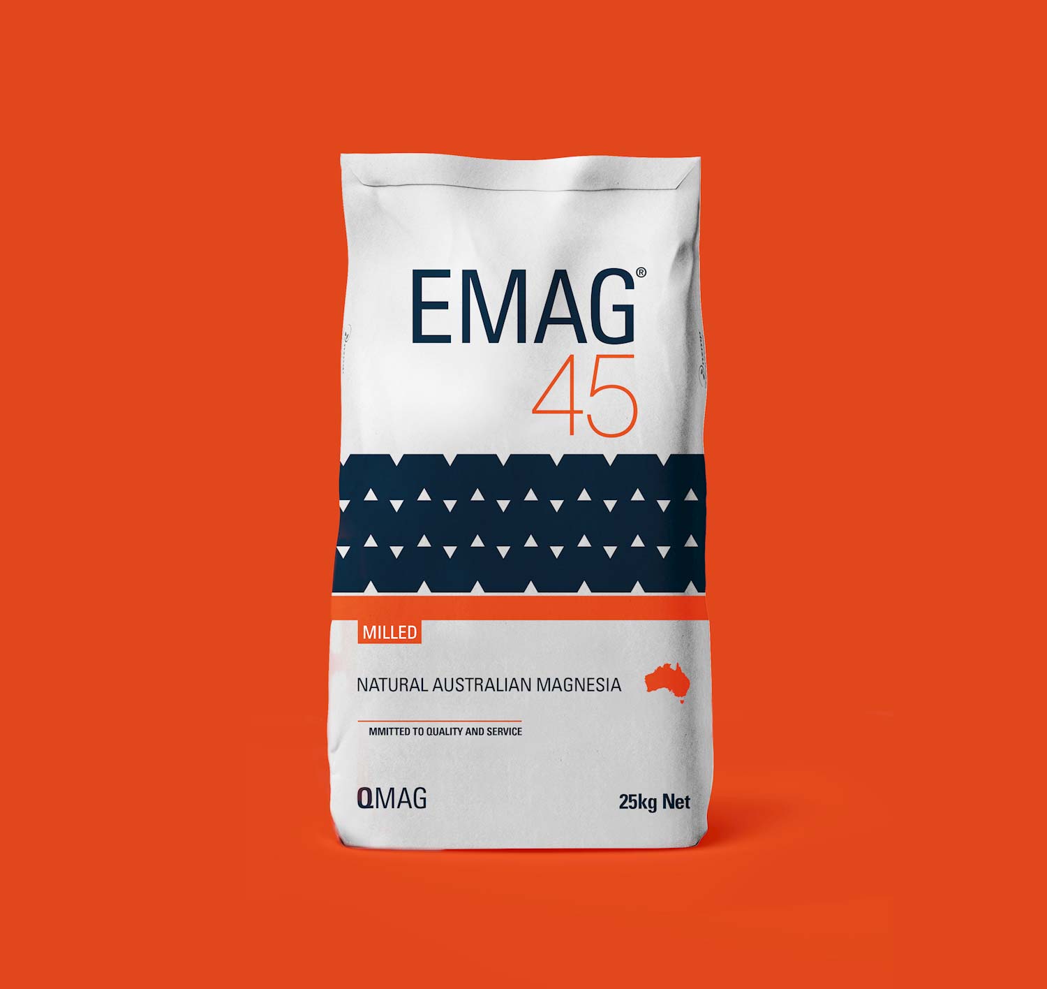
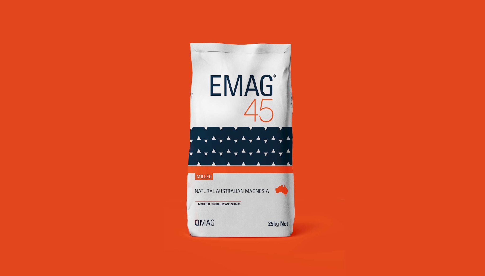
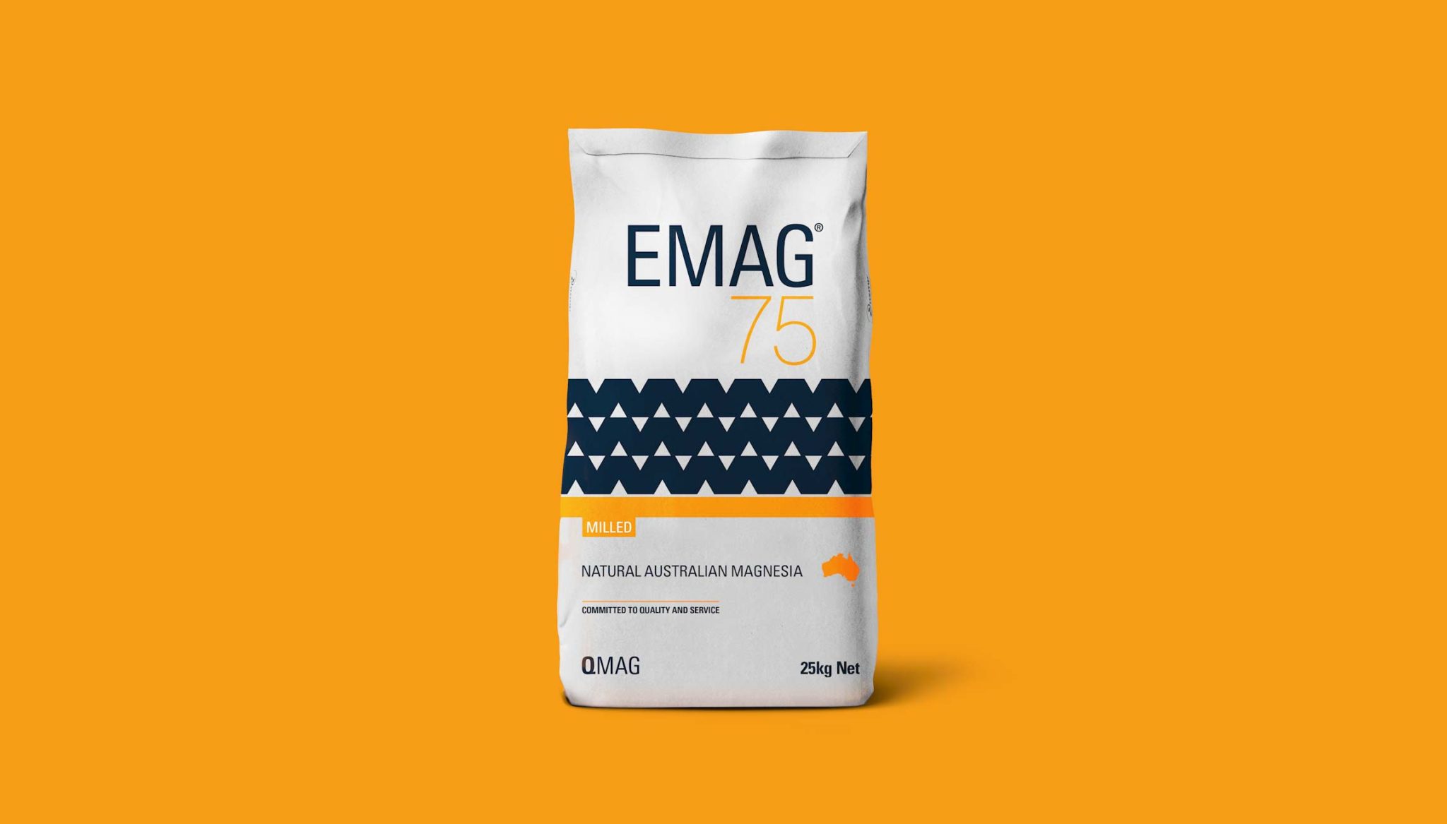
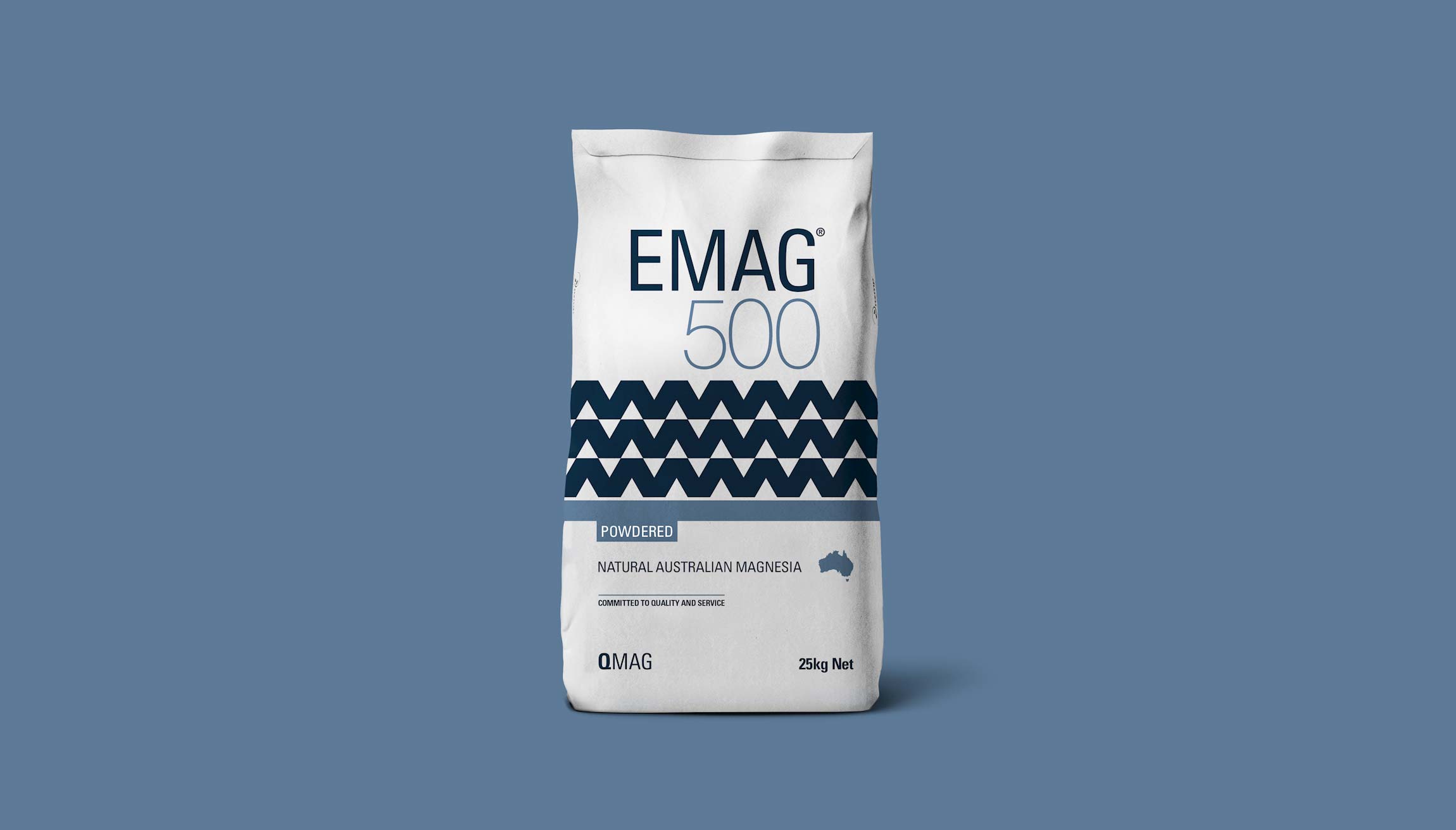
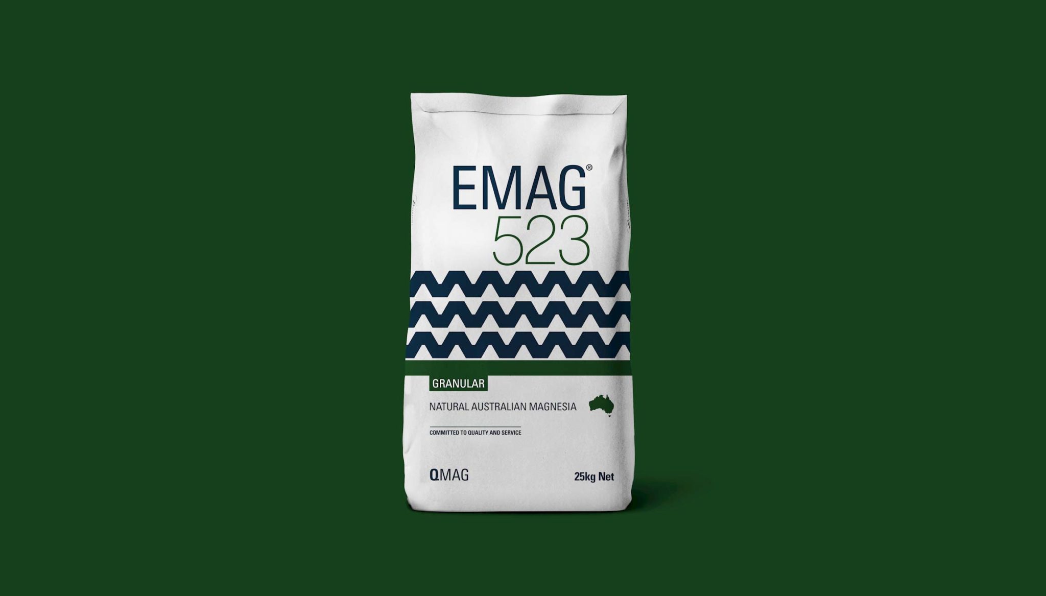
QMAG approached us needing their packaging re-designed, from a standard brown bag to something with more shelf appeal.
The brief contained the key words, high-quality, trustworthy, reliable, consistent and Australian-made.
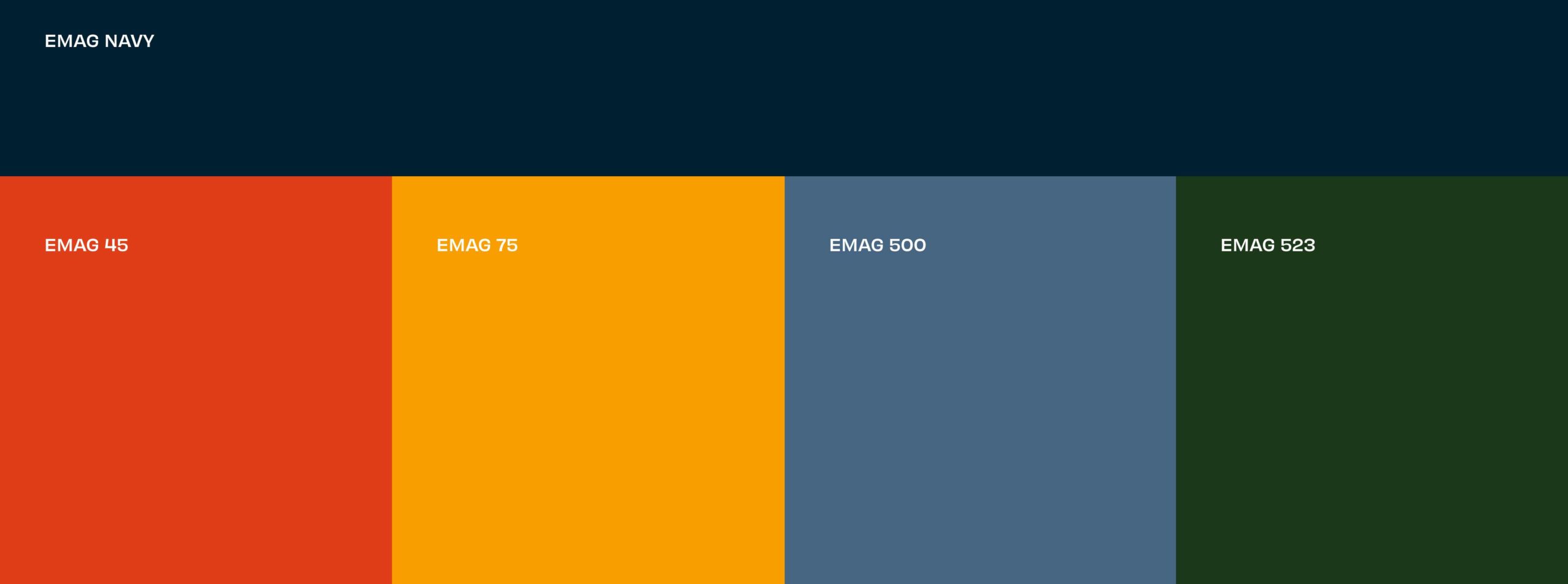
Our challenge was to transform the packaging to appeal to a variety of audiences from Australian farmers, through to industrial chemists and white-collar procurement managers. Customers buy EMAG for its performance and technical properties rather than shelf-appeal but it is important the product is easily distinguishable as EMAG. The second challenge was to ensure each variety was easy to distinguish on the shelf, not only by colour.