Co & Pace Salons
PROJECT OUTLINE
We worked with Justin Pace at Co & Pace Salons to create a striking brand, helping them become the go to salon in Brisbane CBD. The objective was to create professional excellence with commercial presence. The brief outlined that simplicity is the ultimate sophistication, Justin wanted something unforgettable, simple and bold.
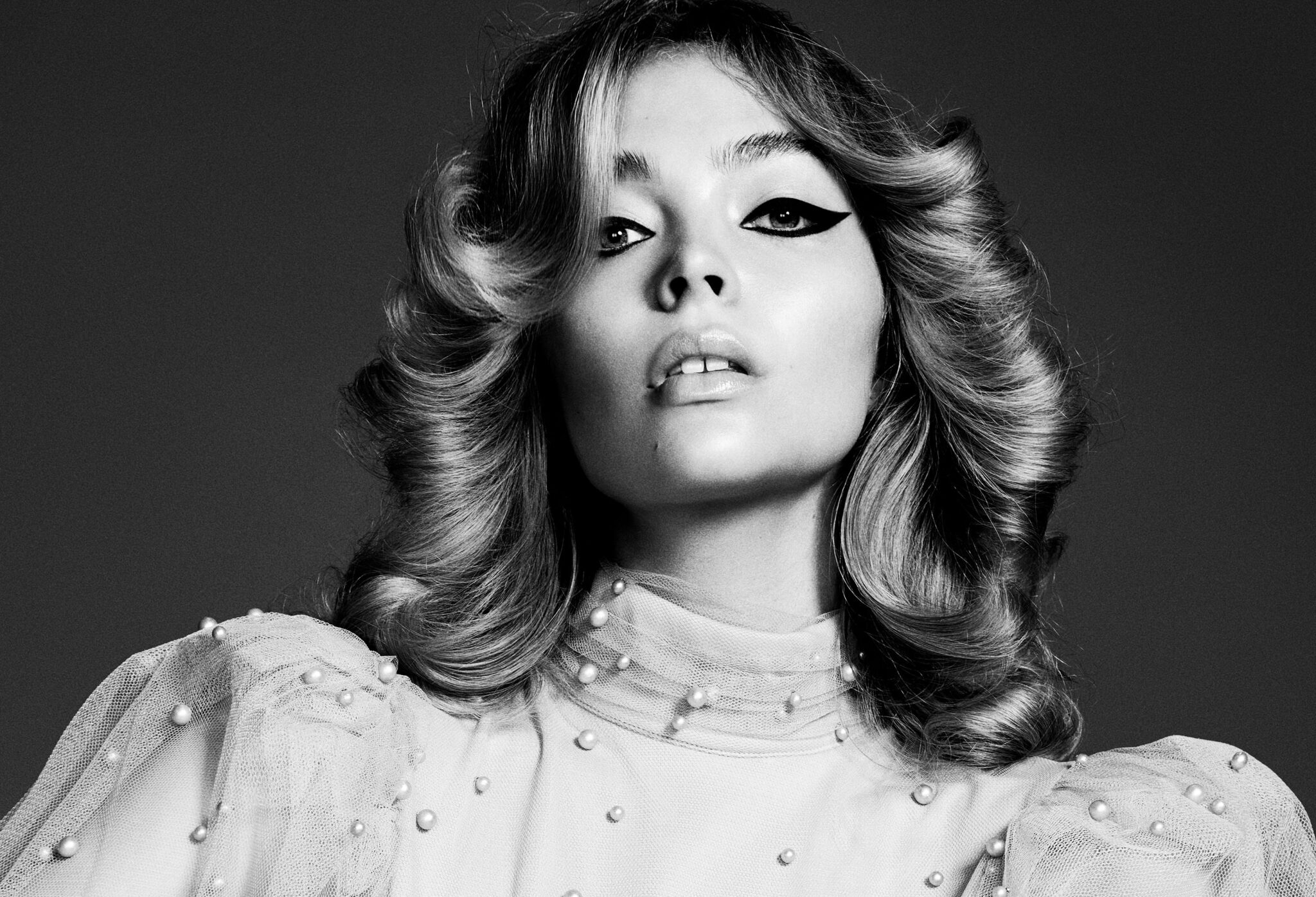
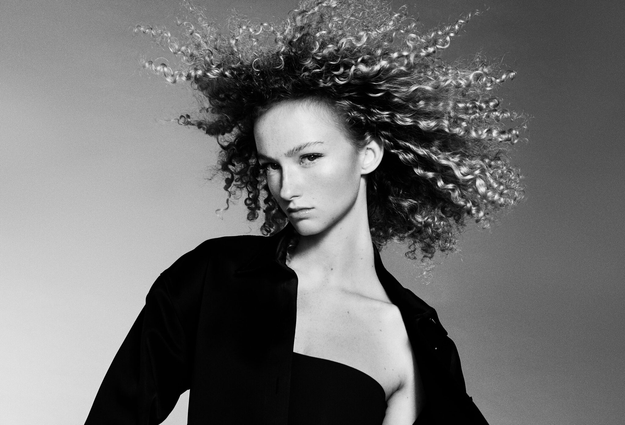
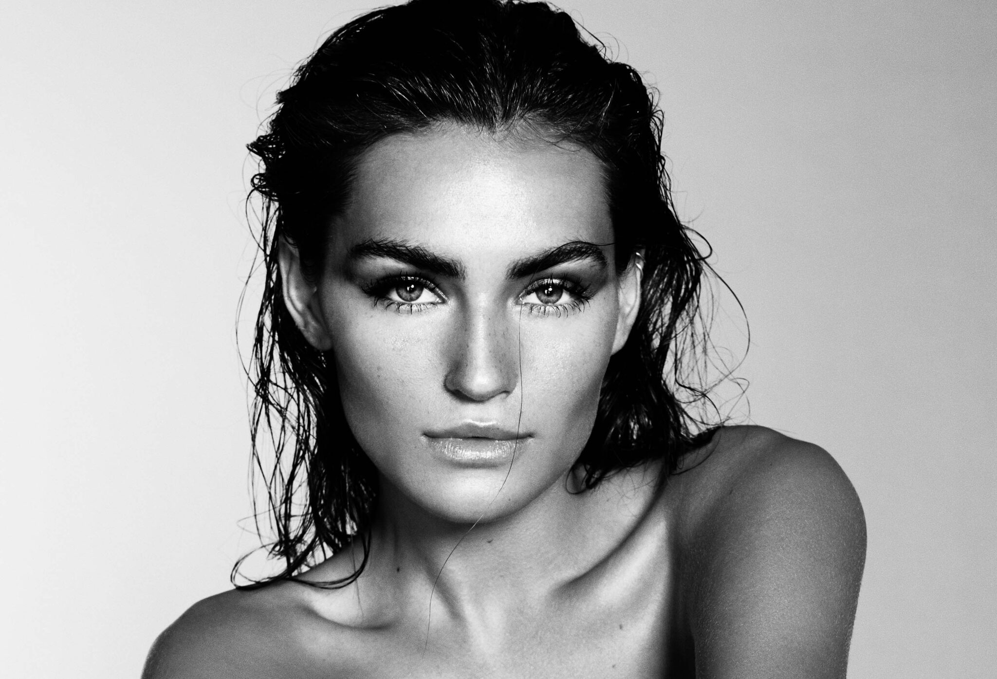
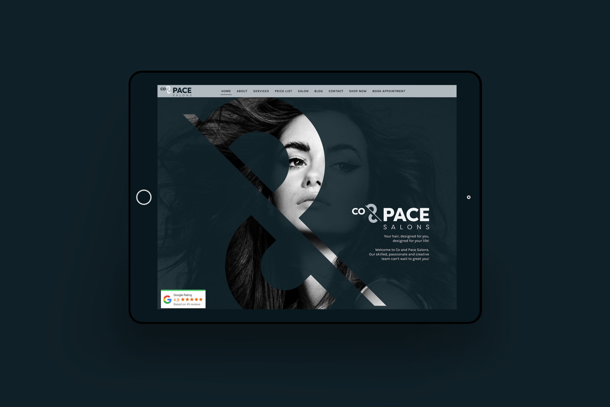
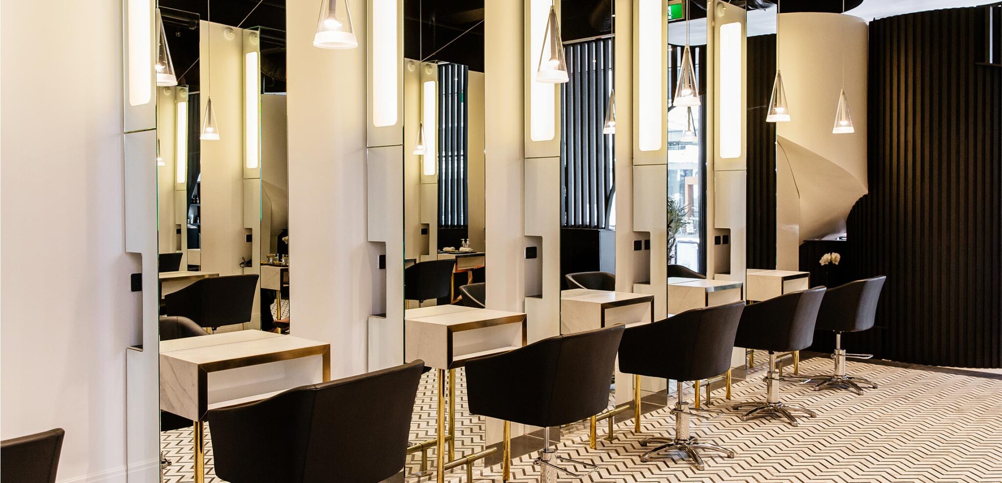
We created a system which utilised the brandmark as a frame to highlight the work of the salon choosing nuetral, dark colours for the base of the website and brand to create contrast and showcase the colours in a striking way.
KEY MESSAGING
+ Strong
+ Impactful
+ Professional
DELIVERABLES
+ Brand identity design
+ Website design
+ Collateral design
+ Project management

THE BRAND MARK
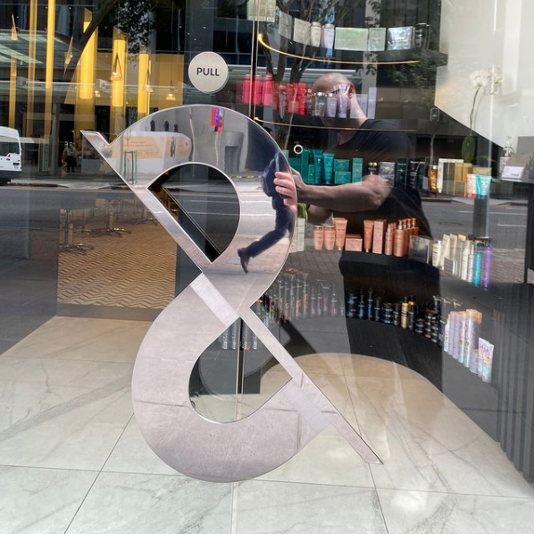
We designed a custom apersand made up of the intials of the brand, it included the C & P separately but also the S as a complete tying together all elements of the word to create a custom icon. We always strive for flexible, memorable brands which can be used on a range of applications. For Co & Pace Salons we have designed tote bags, small stickers, banners and Justin worked with his fit-out team to turn the icon into his door handle, injecting brand presence for the customer at every touch point.
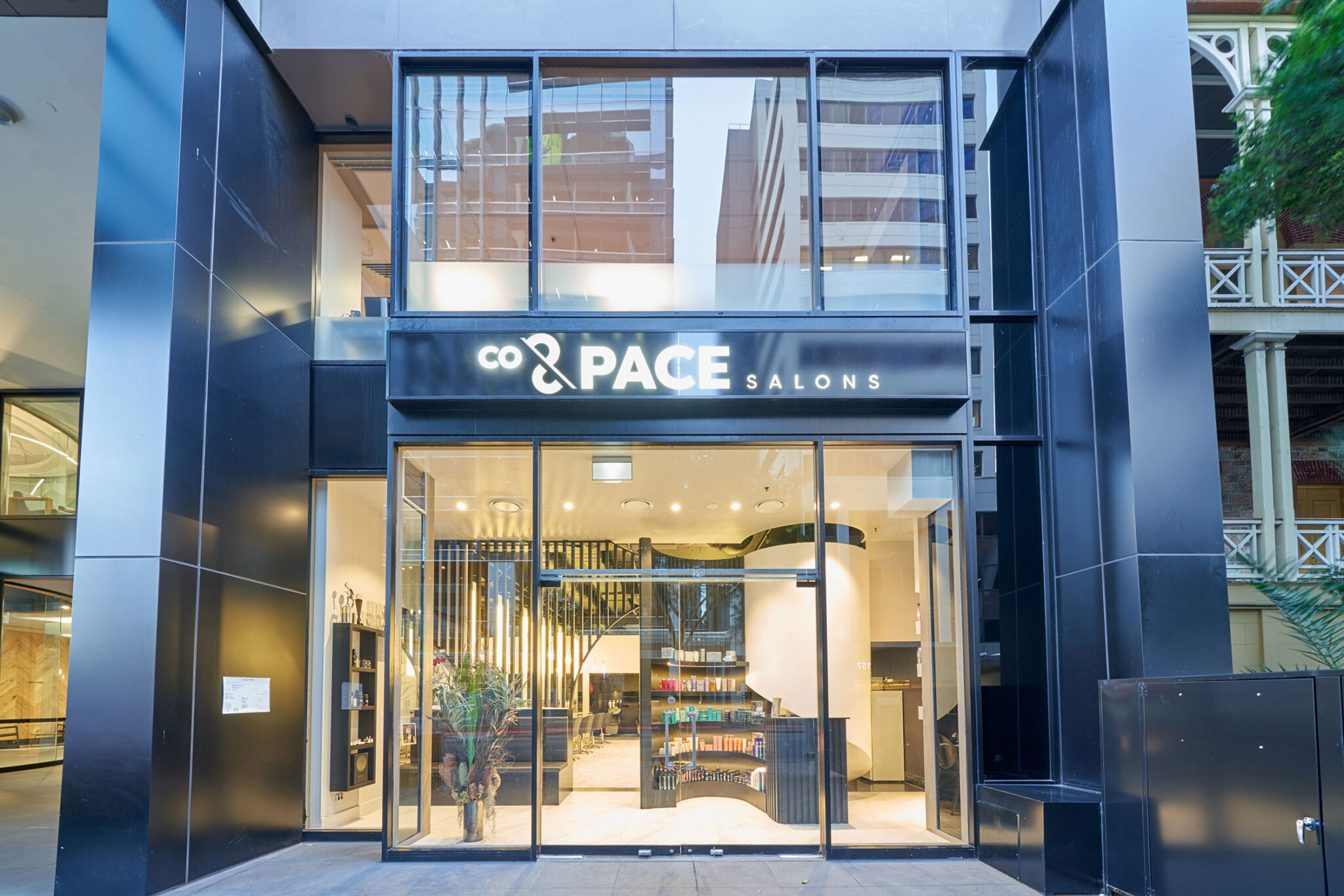
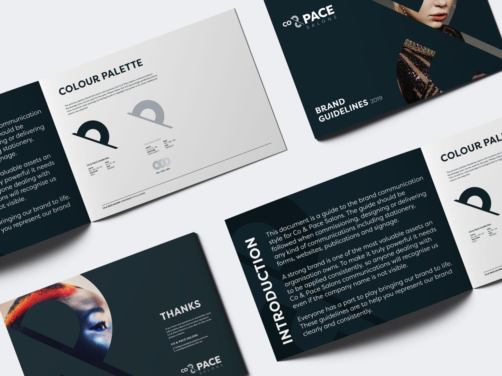
Co & Pace left with a full brand identity and stationery suite which he could use to begin building their new brand presence.
