Look of Australia
PROJECT OUTLINE
Look of Australia was due for a re-brand, they had recently revised their brand messaging and needed a new identity to match. Their brand messaging was, “We are colourful and vibrant, we exist to help our patients feel excited about eyecare.”
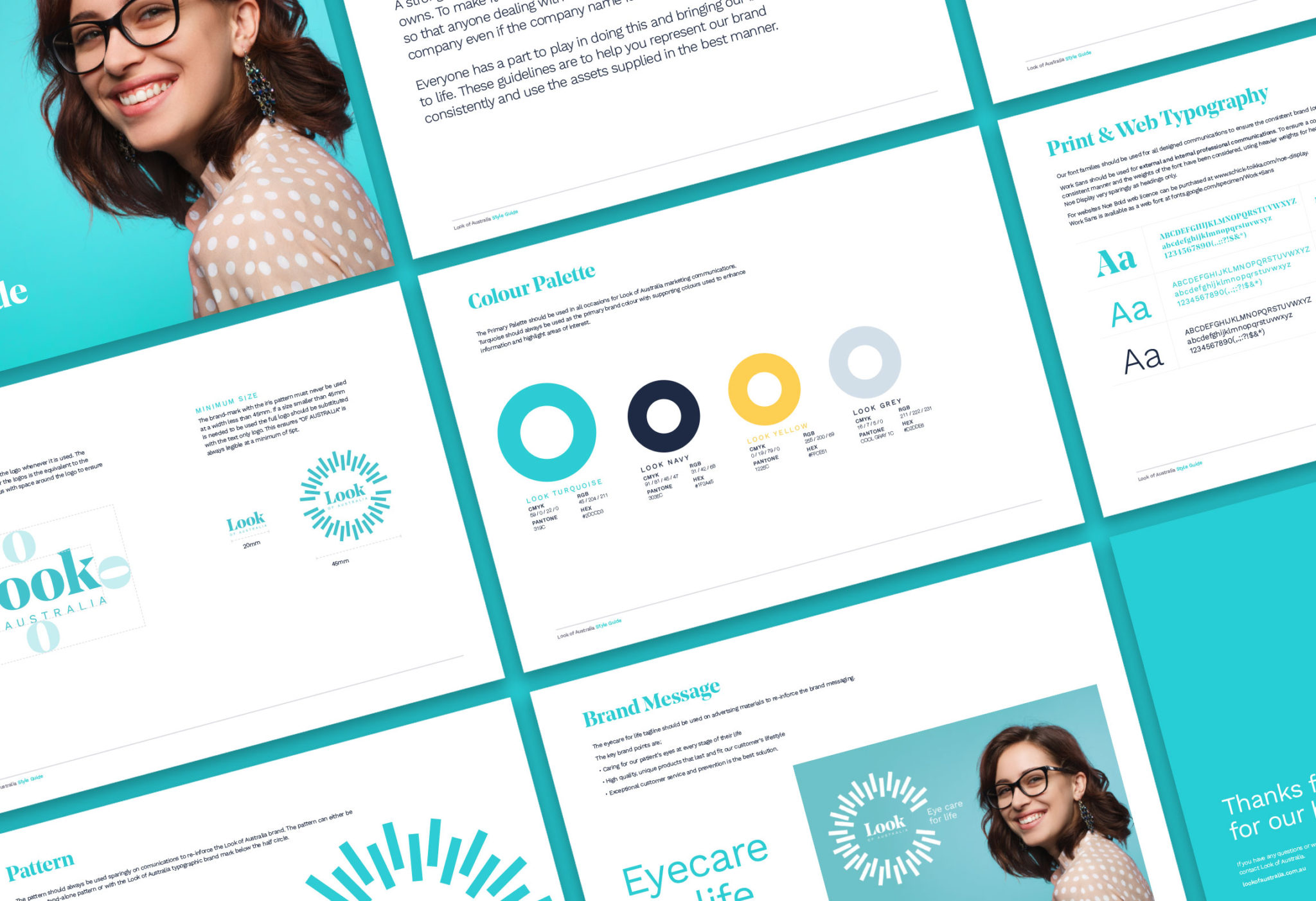
A new logo and full visual identity suite was delivered. The concept behind this identity was through the exploration of the human eye. We discovered each iris is as unique as a fingerprint, this lended itself perfectly to Look of Australia’s values which is offering products unique to each customer.
TOOLS
+ Adobe Illustrator
+ Adobe Indesign
+ Adobe Photoshop
PARTNERS
We proudly collaborated with Jackett Agency who developed the strategy and project management.
DELIVERABLES
+ Brand proposal
+ Brand identity design
+ Packaging design
+ Collateral design
+ Mock-ups
PROJECT OUTLINE
Look of Australia was due for a re-brand, they had recently revised their brand messaging and needed a new identity to match. Their brand messaging was, “We are colourful and vibrant, we exist to help our patients feel excited about eyecare.”
A new logo and full visual identity suite was delivered. The concept behind this identity was through the exploration of the human eye. We discovered each iris is as unique as a fingerprint, this lended itself perfectly to Look of Australia’s values which is offering products unique to each customer.
TOOLS
+ Adobe Illustrator
+ Adobe Indesign
+ Procreate
DELIVERABLES
+ Brand proposal
+ Brand identity design
+ Packaging design
+ Collateral design
+ Mock-ups

BRAND MARK
The re-design created a new fresh look which helped Look of Australia re-position themselves to compete with more premium competitors. The simple typographic mark works on its own as well as alongside the pattern suite.
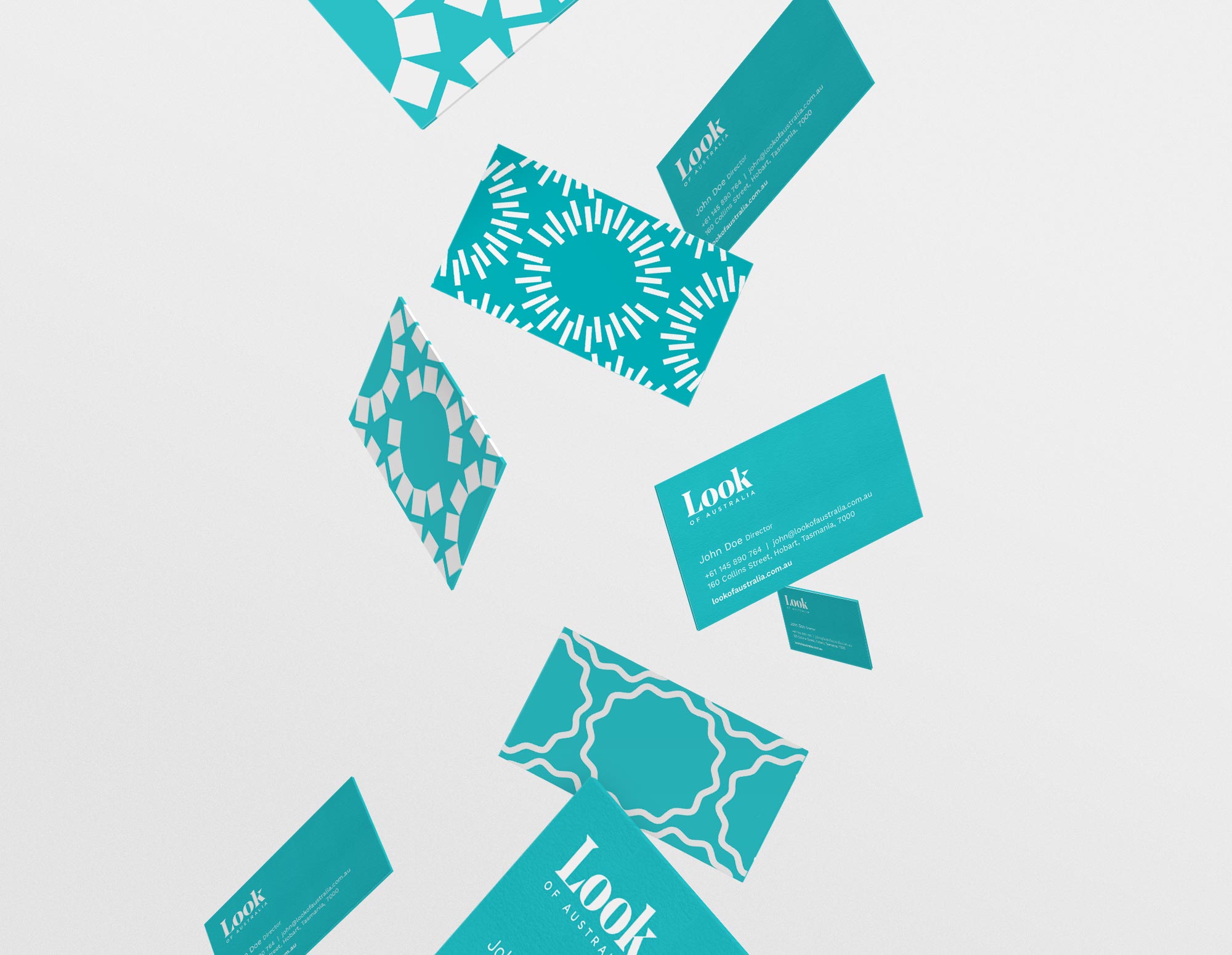
Look of Australia now have a high-end reputable brand, which re-positioned them in the eye care market.
BRAND & PATTERN
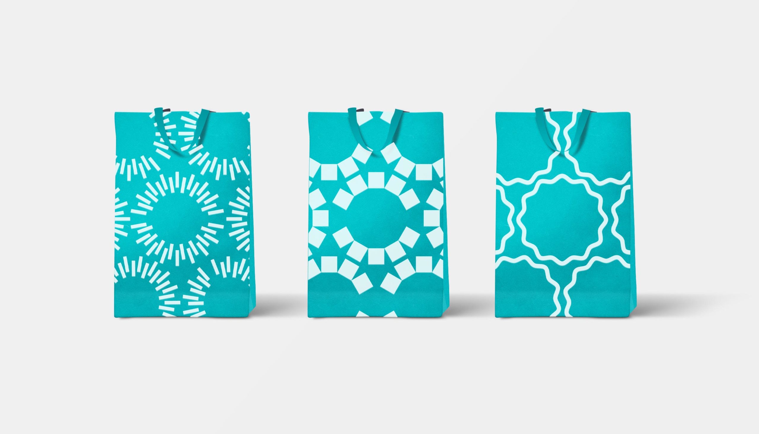
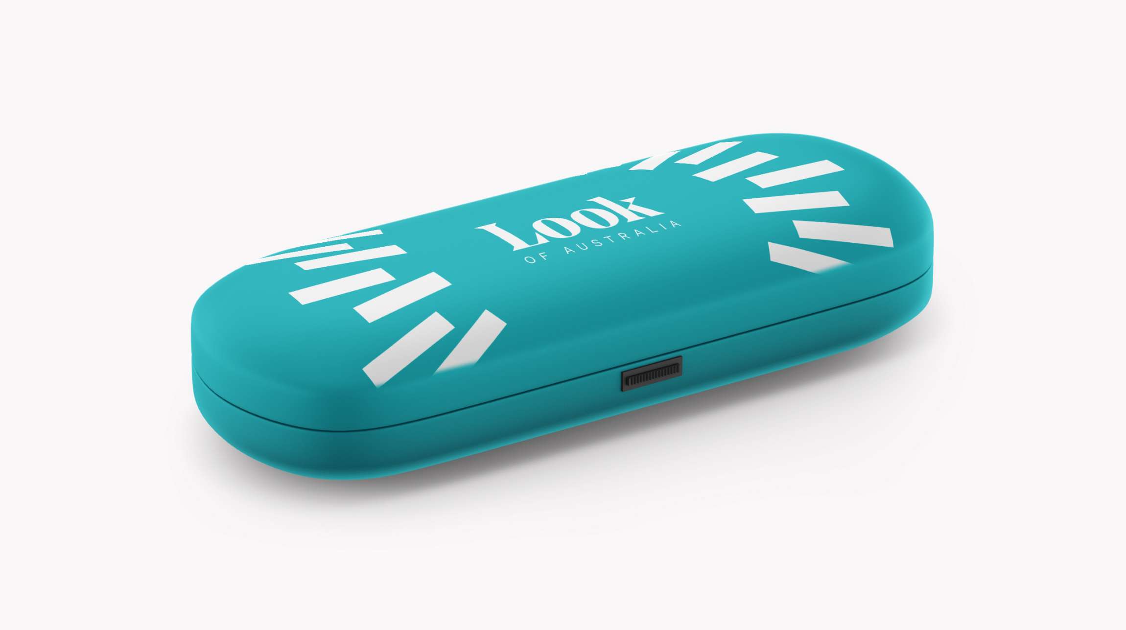
Exploring patterns of the iris, a suite of patterns were developed.
The rationale was based on every customer being unique with Look of Australia striving to offer products and services unique to every customer.
The teal brand colour was defined to create an instantly recognisable brand at a glance, alongside the pattern suite.
