Silky Oaks
PROJECT OUTLINE
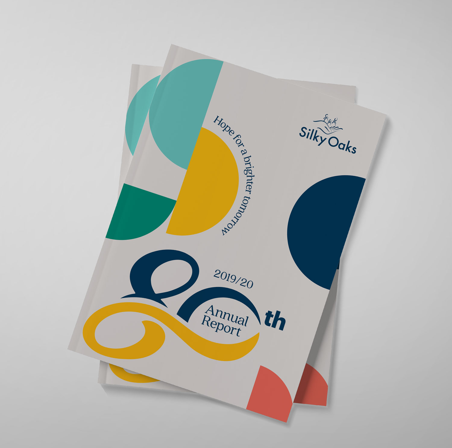
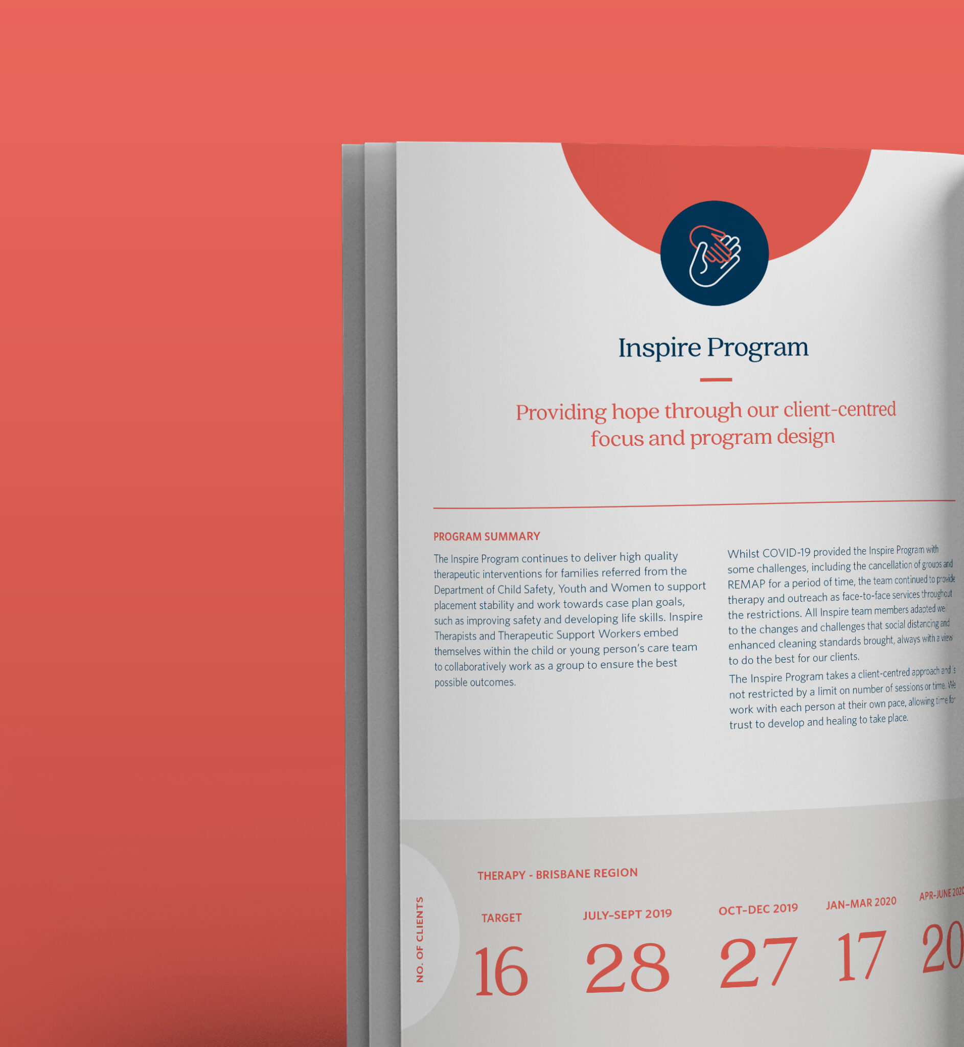
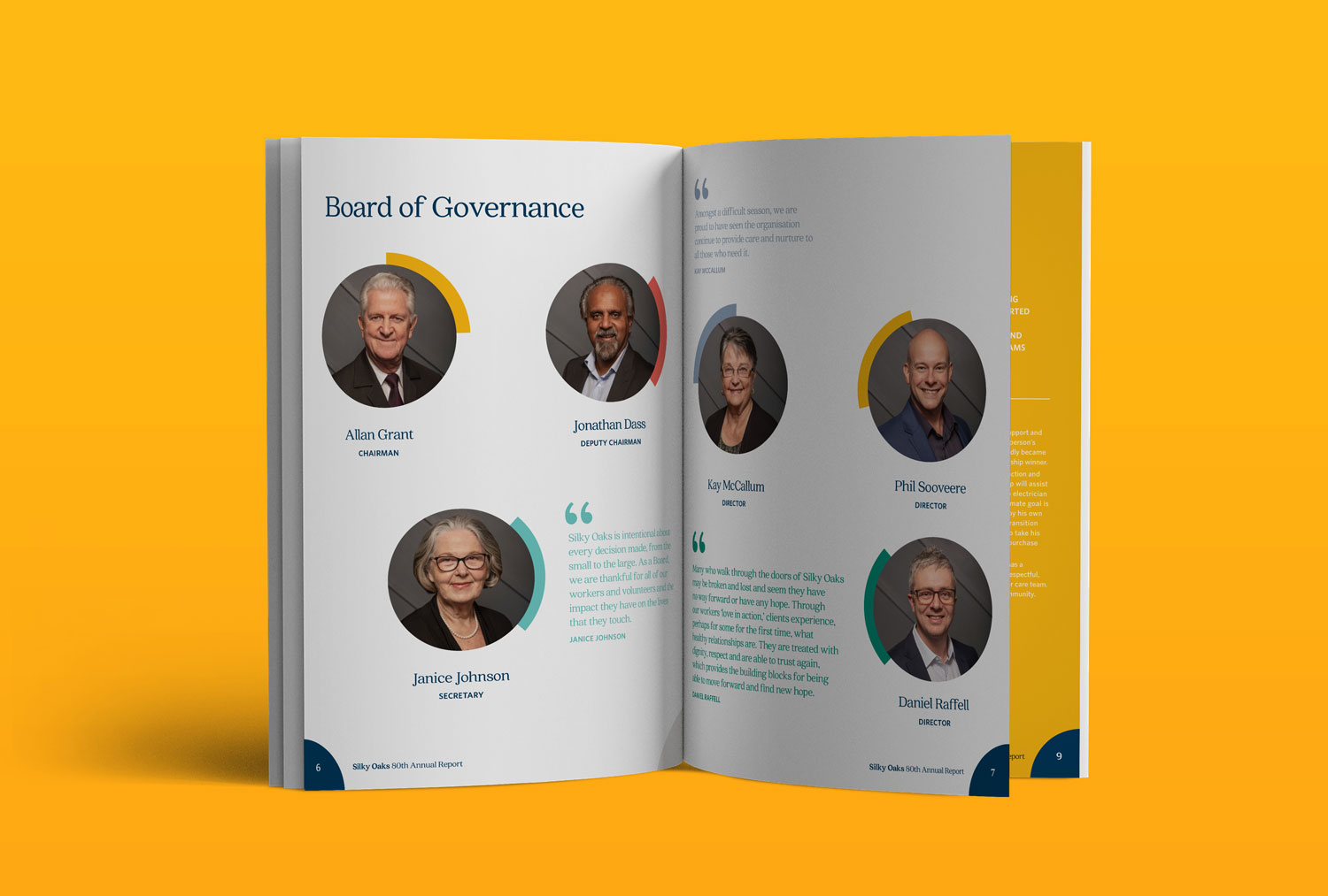
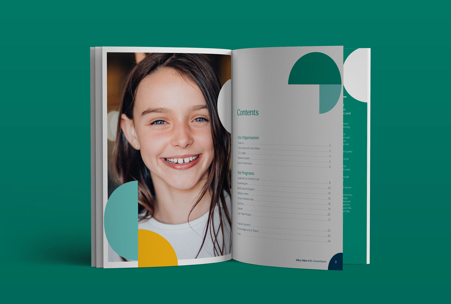
Silky Oaks is a not-for-profit charity, who for over 80 years has been helping people experiencing vulnerability and disadvantage achieve hope for a brighter tomorrow. I worked alongside the marketing and communications co-ordinator at Silky Oaks to design a new look for their 80th Anniversary Annual Report and refreshing their brand image.
TOOLS
+ Adobe Illustrator
+ Adobe Indesign
+ Adobe Photoshop
DELIVERABLES
+ Annual report design
+ Website design & build
+ 80th Anniversary Logo design
+ Collateral design
+ Project management
PROJECT OUTLINE
Urban Cribs makes functional, sophisticated modular homes to suit
a style savvy buyer.
A brand was created with a perfectly square, modern typeface fitting with the modular homes concept. A colour palette of warm tones, charcoal and a neutral green was chosen to nod to the environmental impact Urban Cribs proudly stands by whilst still appealing to their upmarket customer.
We worked with our print partners to choose a premium, textured stock with a laminate to avoid spillage marks, finished with a hot copper foil, which created a high-end product.
TOOLS
+ Adobe Illustrator
+ Adobe Indesign
+ Adobe Photoshop
DELIVERABLES
+ Brand identity design
+ Website design
+ Collateral design
+ Project management
THE ANNIVERSARY LOGO
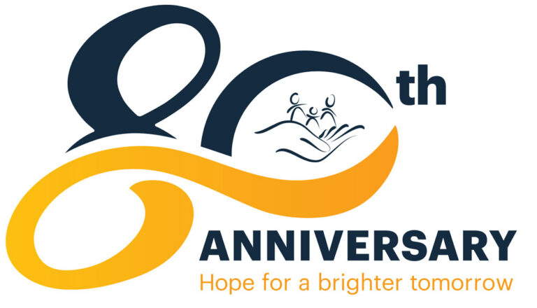
We developed a one off brand-mark for Silky Oaks Children’s Haven’s 80th Anniversary. Using their existing hand graphic we embedded this inside the 80th typeface to create a memorable mark for the occassion.
