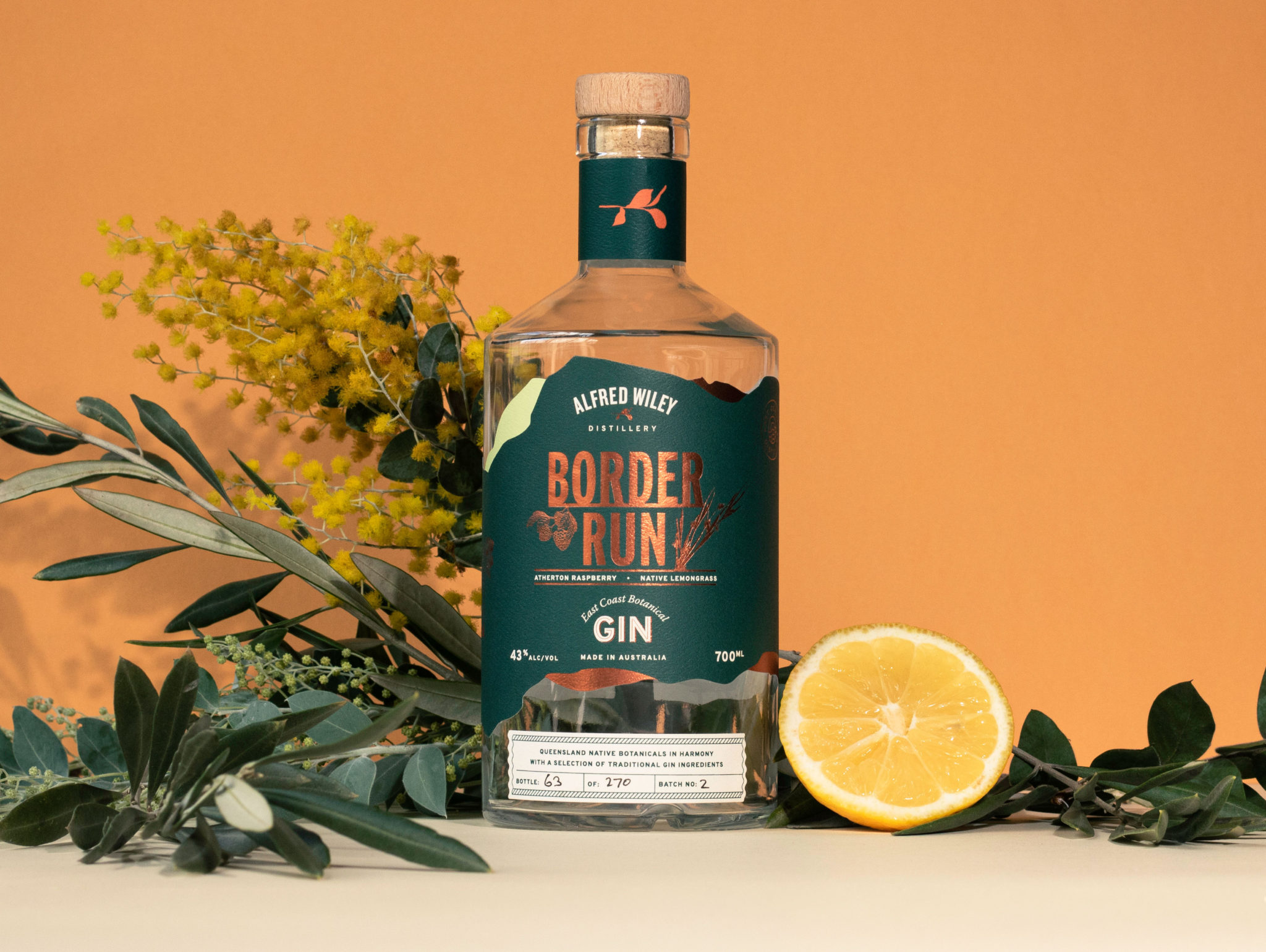
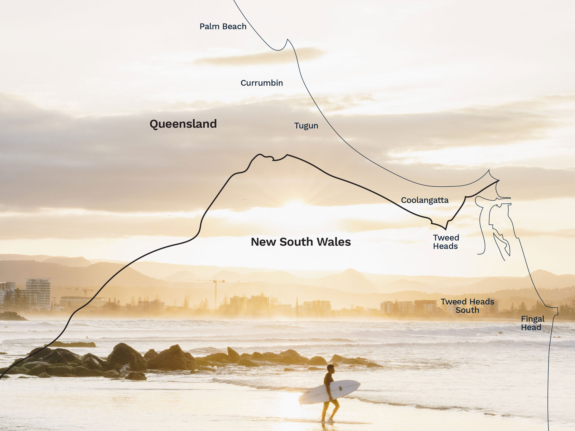
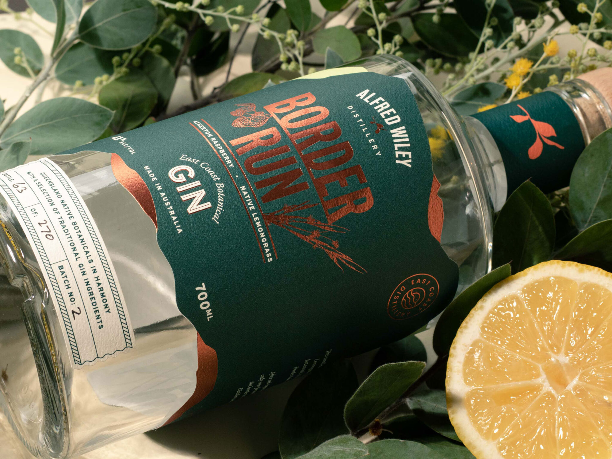
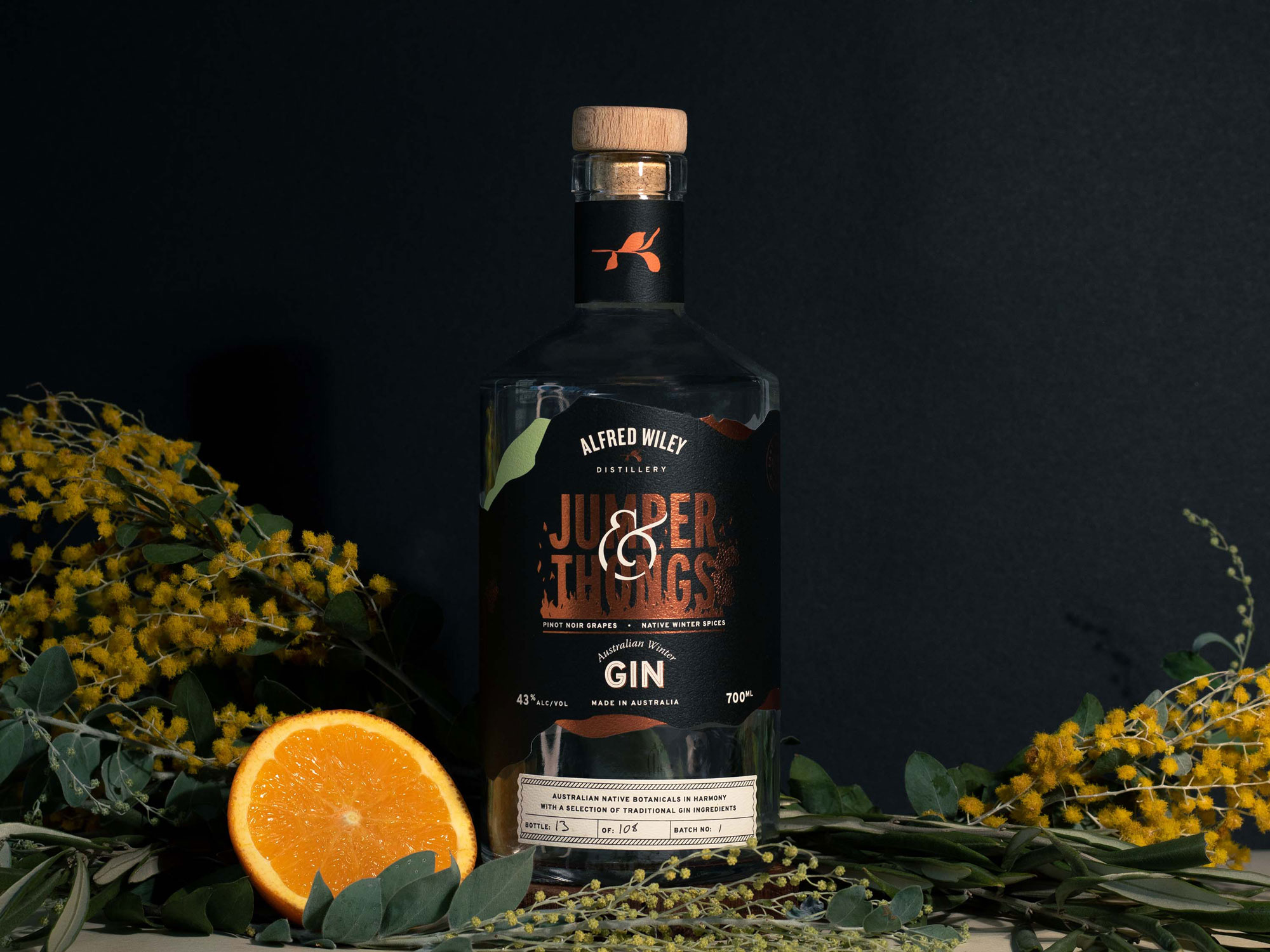
We worked with Alfred Wiley Distillery to create their full brand identity and develop conceptual packaging for their initial Gin launch. The concept was based on the shape of the border between New South Wales and Queensland. We designed a custom die-line to enhance the idea of the border between the states with overlapping shapes to tie back to the mountains of the Glasshouse Mountains region, where the ingredients were sourced.
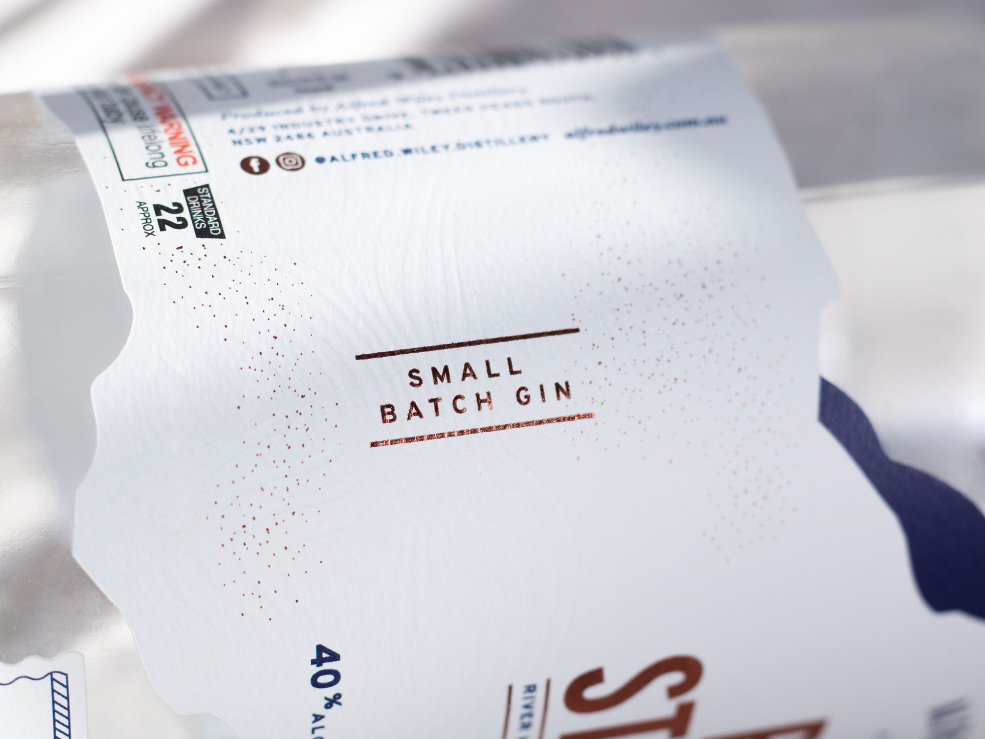
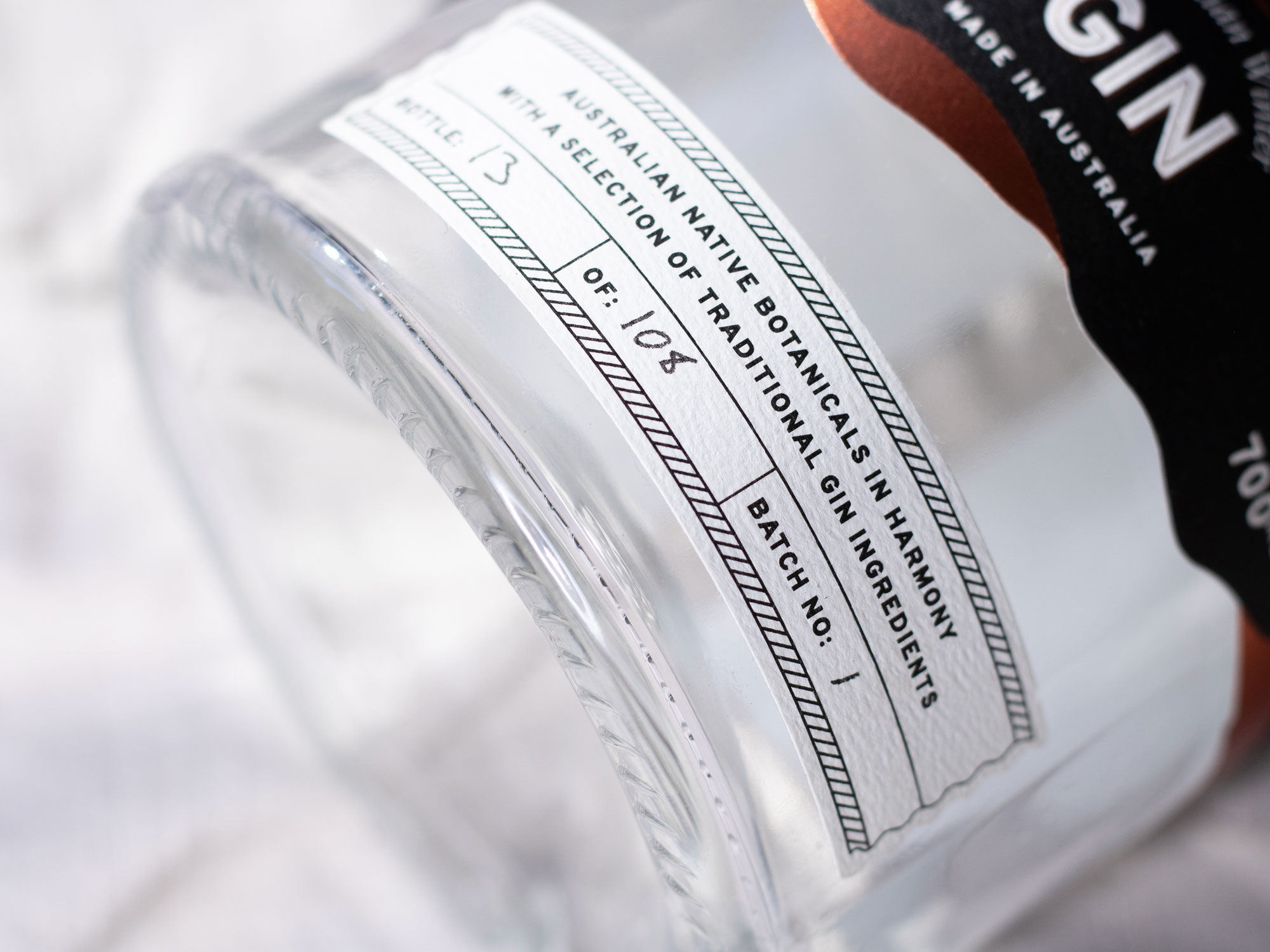
We worked with our print partners to choose a premium, textured stock with a laminate to avoid spillage marks, finished with a hot copper foil, which created a high-end product.
We worked with Alfred Wiley Distillery to create their full brand identity and develop conceptual packaging for their initial Gin launch. The concept was based on the shape of the border between New South Wales and Queensland. We designed a custom die-line to enhance the idea of the border between the states with overlapping shapes to tie back to the mountains of the Glasshouse Mountains region, where the ingredients were sourced.
We worked with our print partners to choose a premium, textured stock with a laminate to avoid spillage marks, finished with a hot copper foil, which created a high-end product.
TOOLS
+ Adobe Illustrator
+ Adobe Indesign
+ Adobe Photoshop
DELIVERABLES
+ Brand identity design
+ Packaging design
+ Collateral design
+ Specialty print management
+ Project management
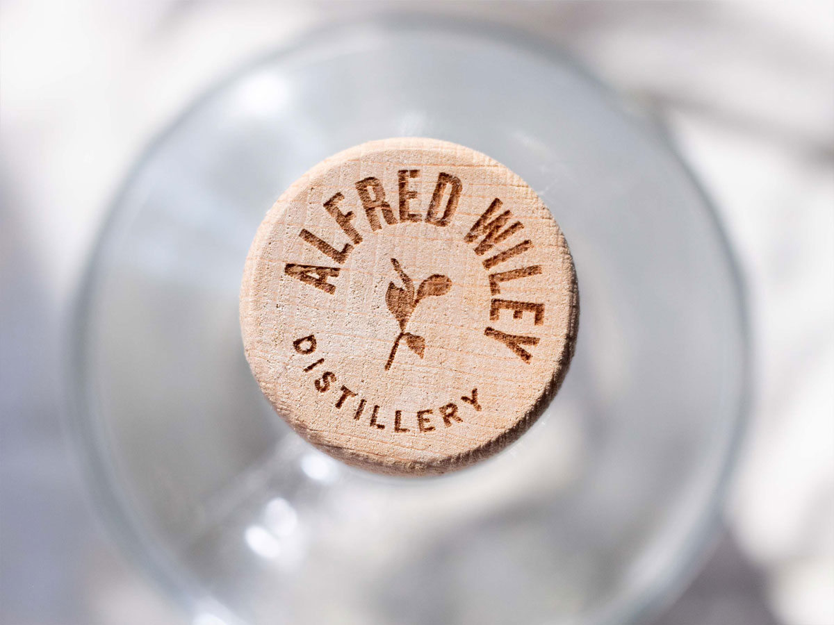
THE LOGO
The logo draws on the leaves of the Australian Myrtle, which is the key ingredient used in Alfred Wiley’s first signature Gin. It was important to keep the leaf non-descript to suit any spirits, however, the link back to the native plants found in Queensland kept the brand feeling not only unique but gave the brand subtle meaning and depth.
Alfred Wiley Distillery scored in the small batch distillery sector, launching their first batch of gin, followed by two more products within their first year.
THE GIN LABEL concept
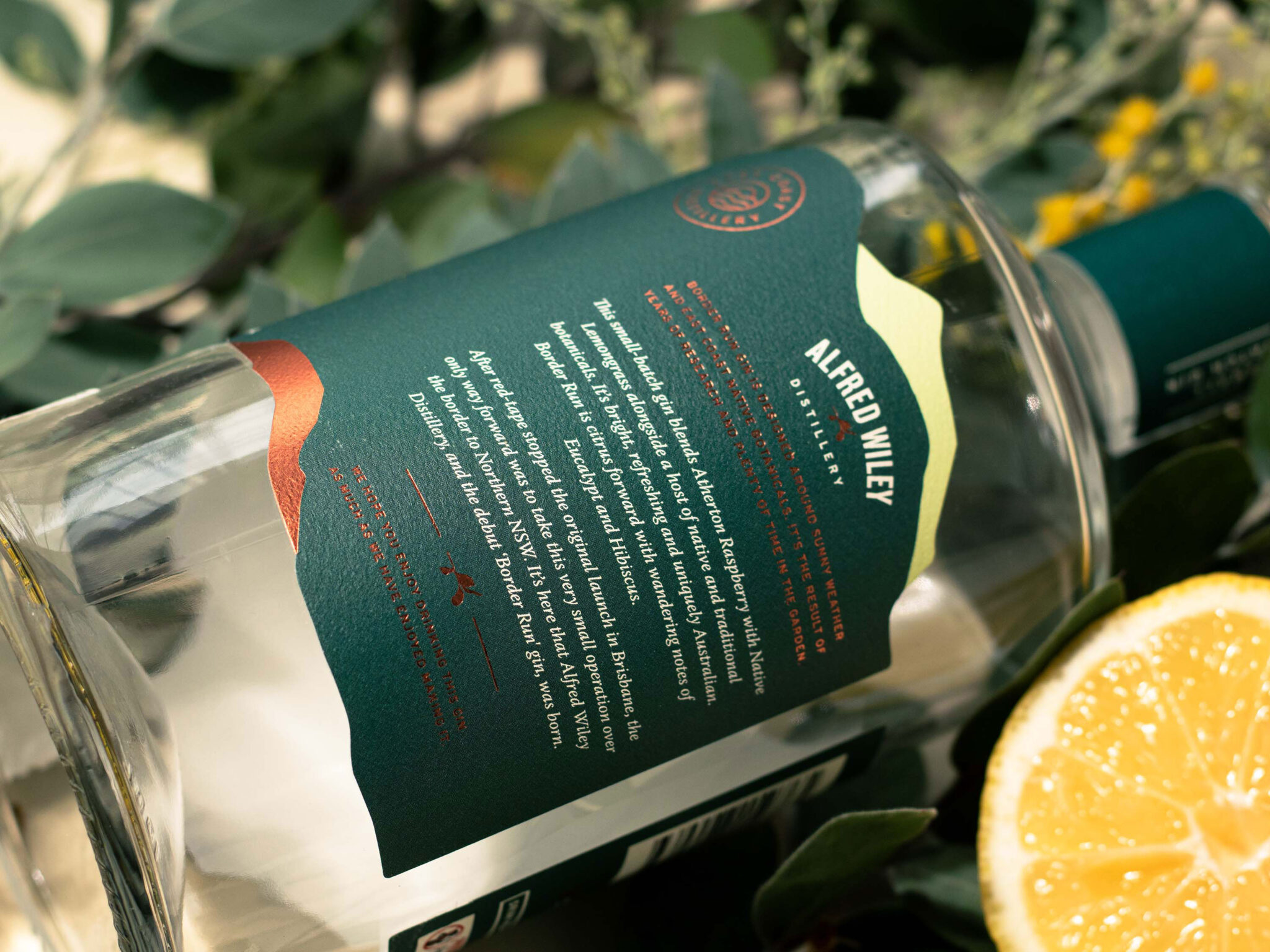
After red-tape stopped the original launch in Brisbane, the only way forward for this very small distillery was to take their berries over the border to northern New South Wales.
The concept for the label was designed around the idea of the New South Wales and Queensland Border, we worked through many versions of this map design and landed upon a bold, simplified version of it with overlapping mountains to reference back to the Glasshouse Mountains region, where the ingredients were mainly sourced. This was a perfect way to tie the two regions which was then used as a identifying feature for the full Gin range.
KIND WORDS
Lauren has consistently blown me away with her ability to translate briefs into beautiful designs that stand the test of time. We always get a lot of compliments for our designs.